In one of the latest articles, we took a deep dive into the concept of Expected Goals (xG), which you can check out here. Now, we’d like to take that theoretical understanding and put it into practice. Let’s look at how certain players are performing compared to what the xG metric suggests they “should” be achieving. In other words, we’ll see who’s scoring or assisting more (or less) than we’d reasonably expect.
Here’s a quick reminder:
- xG (Expected Goals) estimates the number of goals a player should have scored based on the quality of his chances.
- xA (Expected Assists) estimates the number of assists a player should have made.
- Adding xG and xA together gives us xI (Expected Involvement), which represents the total number of goals and assists a player should have contributed.
By comparing a player’s Total Involvement (actual goals + assists) with their Expected Involvement (xG + xA), we can see how many more (or fewer) goal involvements they have achieved compared to what was expected.
The data for xG and xA comes directly from the Official FPL website and covers the entire season, starting from Gameweek 1.
Charts explained
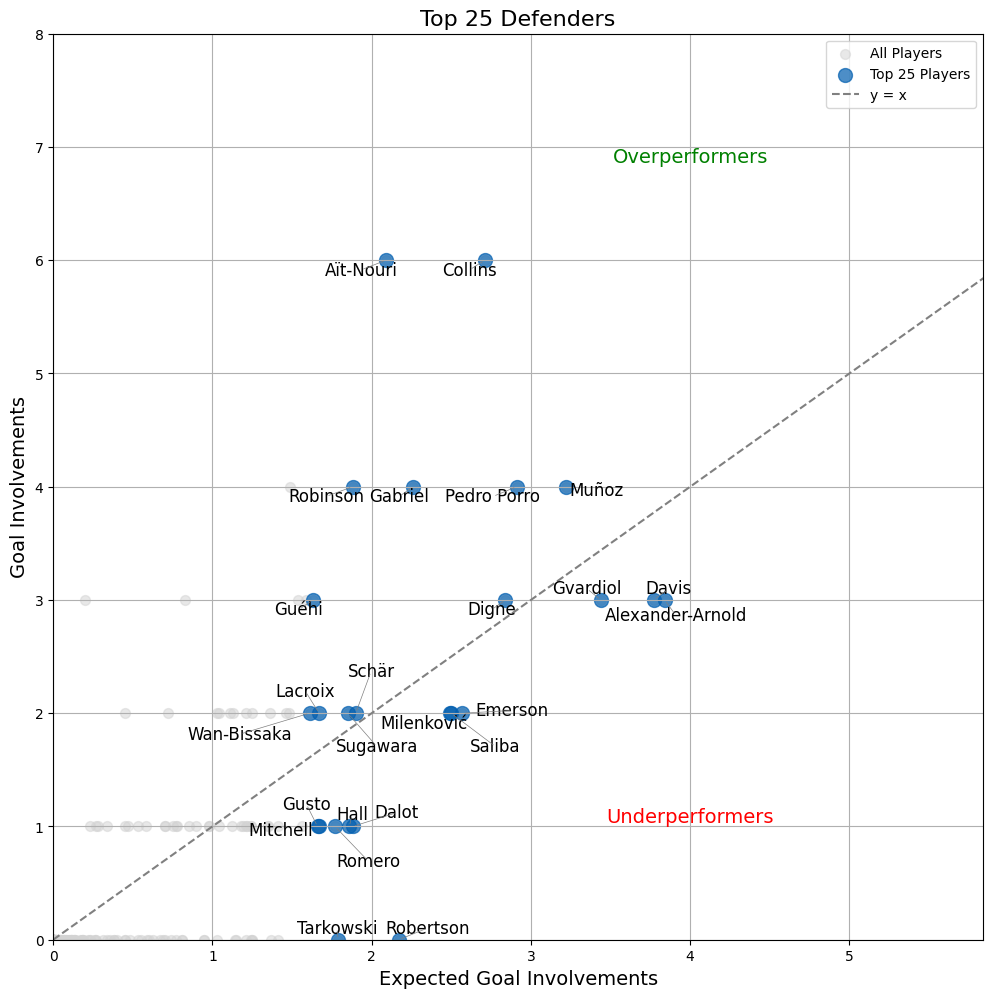
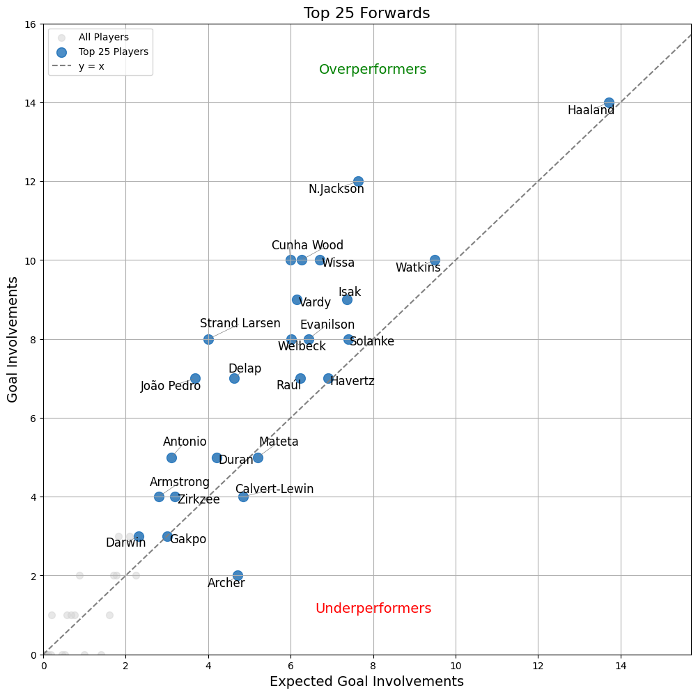
The charts below show two variables: Actual Involvement (goals + assists) on the vertical axis and Expected Involvement (xG + xA) on the horizontal axis.
If all players performed exactly as expected (i.e., Actual Involvement = Expected Involvement), every point on the chart would fall on a straight 45° line. This line, shown in grey on the chart, represents the “fair performance” scenario.
- Players above the line are overperformers, meaning their Actual Involvement is higher than their Expected Involvement (they achieved more goals or assists than expected given the quality of chances they have).
- Players below the line are underperformers, meaning their Actual Involvement is lower than their Expected Involvement (they achieved fewer goals or assists than expected).
The vertical distance between a player’s point and the grey line represents the margin by which they overperformed or underperformed. The greater this distance, the larger the difference between the player’s actual performance and what was expected.
Defenders before GW16 (season data GW1 – GW15)

Defenders – Top Overperformers:
Aït-Nouri: +3.91
Collins: +3.29
Robinson: +2.12
Defenders – Top Underperformers:
Robertson: -2.17
Tarkowski: -1.79
Dalot: -0.88
Midfielders before GW16 (season data GW1 – GW15)

Midfielders – Top Overperformers:
M.Salah: +7.82
Saka: +7.12
Palmer: +4.64
Midfielders – Top Underperformers:
Gordon: -2.23
Andreas: -2.15
Sávio: -2.07
Forwards before GW16 (season data GW1 – GW15)

Forwards – Top Overperformers:
N.Jackson: +4.37
Cunha: +4.01
Strand Larsen: +3.99
Forwards – Top Underperformers:
Archer: -2.72
Calvert-Lewin: -0.85
Mateta: -0.20
Disclaimer: Interpreting the Data Correctly
It’s tempting to label players who outperform expectations as simply “better” and those who underperform as somehow lacking. But the reality is far more nuanced.
xG and xA Reflect Probabilities, Not Certainties
These metrics are based on the quality of chances and the likelihood of converting them into goals or assists. These stats estimate what’s likely, not what must happen. They don’t account for intangible factors like a player’s individual skill, their form, the pressure of the match, or even a brief bad run of luck.
A player consistently outperforming their xG might indicate exceptional finishing ability, while underperforming might suggest room for improvement—or simply bad luck.
Small Sample Sizes Can Be Misleading
The charts represent data from Gameweek 1 to the specified gameweek. Overperformance or underperformance over a short period might not indicate a true trend but could result from random variance.
Tactical Roles Matter
A player with high xI (Expected Involvement) might play in an advanced position or take set pieces, or penalties, skewing their numbers compared to others in the same position.
Context Is Key for Over/Underperformance
Overperformers are not necessarily “better” players, and underperformers are not necessarily “worse.”
For example, overperformers might benefit from extraordinary finishing or luck, while underperformers could face tough opposition, bad fortune…
The gray line on the chart shows where a player’s Actual Involvement equals their Expected Involvement. Players above or below the line are not inherently good or bad—it simply reflects how their actual contributions differ from what is statistically expected based on their chances.
Contextual Factors and Team Dynamics Are Missing
This analysis doesn’t account for the quality of a player’s teammates, team tactics, or strength of opponents. For example, a forward underperforming their xG might lack strong support from midfielders, affecting their conversion rate.

![3 Best Captain Picks for FPL GW34 [Captaincy Index] fpl best captain picks](https://www.fantasyfootballreports.com/wp-content/uploads/fpl-best-captain-picks.jpg)

